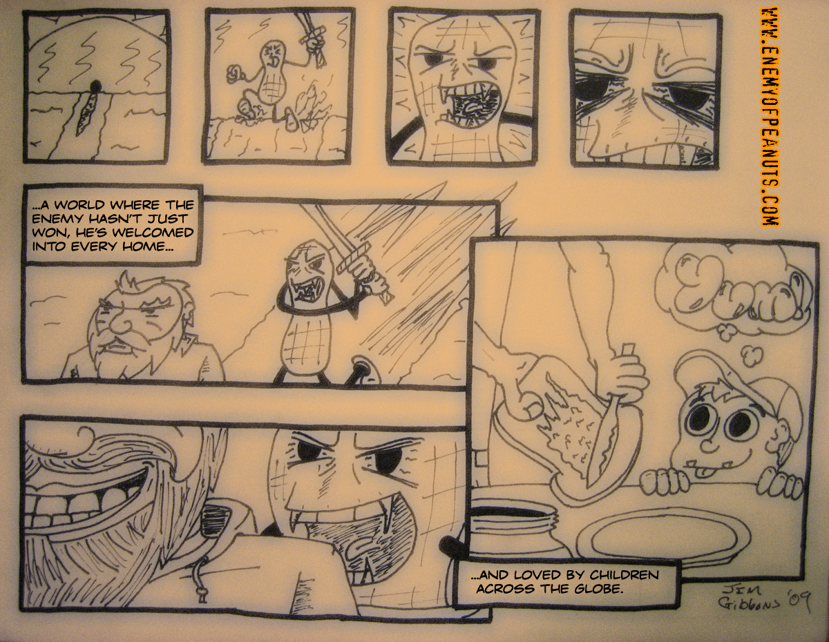
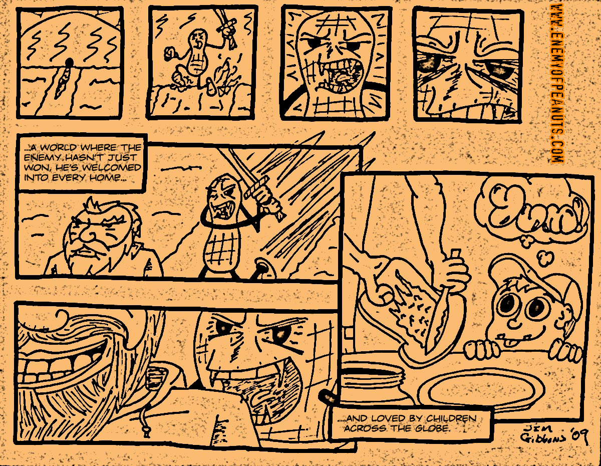
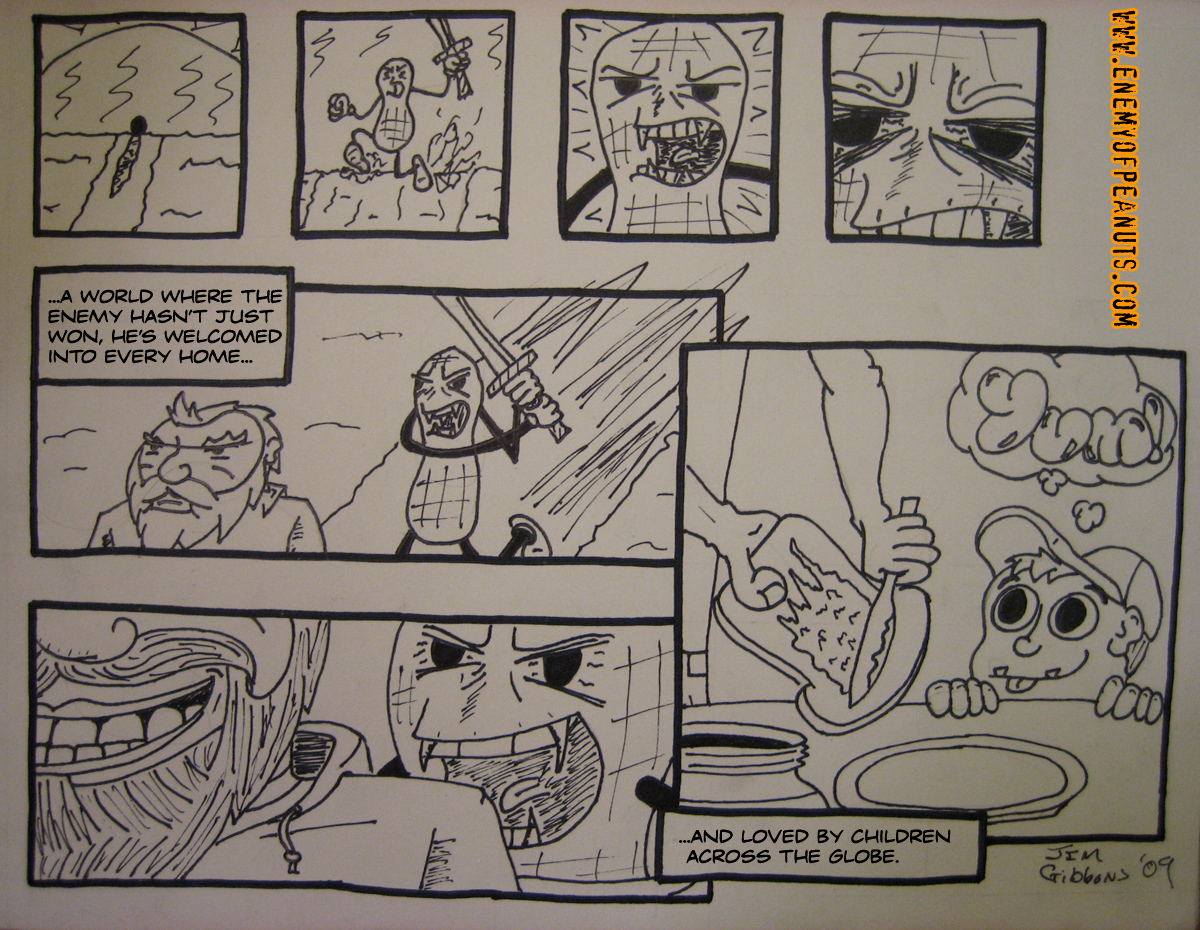
When we last left our hero, he was doing some badass inner-monologueing as he trudged through a desert followed by a mysterious shadow. Let’s see what happens next, shall we?

As I did last time, here is another effect on the comic and an uneffected photo of the drawing.


Whew, second installment done! Things start to pick up here, and we’re still just in the introduction, so you know it is going to get even crazier and at least twice as awesome.
As always, comments are encouraged below! Thanks for stopping by to check out ‘Part 2.’

Hey Jimbo, just offering creative criticism here– I really like the drawings and i’m not sure you even need to enhance your drawings with the effects (though I love fx too.) The second half looks great with the picture in a picture sort of effect with each drawing leading into the next one. I think the weakest link is the intro shot– You might want to make it one of the larger shots like old-school marvel and then zoom in like you did. Finally, I’d just say that looking at the comic you can tell which drawings you spent the most time on and I think when something looks really great all the drawings are equally stellar (then again there are always those little pictures in Wolverine comics that have like 3 colors and look like they took a minute to make…) All in all good, with cinematic story-boarding and depth… I don’t know if you wrote the text yourself or typed it but it looks great too. I think if you found a strong idea that wasn’t expecially obscure in its humor you could have something really great; Also, I remember when we were kids drawing comics together and you had a really distinctive way of drawing people– I hope you don’t get too far away from that with any humorous comics you do because it was fantastic!!! It was very much like a kid’s imagination (think calvin and hobbes.) Peace JIMBO nice site– bill
Thanks for the comment, critique and your patronage Billiam!
This whole webcomic is a bit of me puzzling out how to actually express with art the scene in my mind. I’ve been more on the writer end of things for so long that I could type out plenty of long descriptions of what I want, but when it comes to planning it all in panels, panel layout and whatnot that I am gonna draw…let’s just say I have a newfound amount of appreciation for all comic artists.
I think this strip is better than the last, so hopefully I can take comments like these and learn from my own practice to really start making this thing move from what I would call “amateur” to “decent.” That said, the kind words that make me feel good about my efforts are very much appreciated!
Lastly, I have some more humorous ‘toons and drawings under the “Webcomics” tab at the top of the site. Though I am using a font called CCDaveGibbons (named for the Watchmen artist, not my dad) on EoP: The Webcomic, the little doodle cartoons in the “Casual Cartooning” are all lettered in my own handwriting.
More Peanuts.