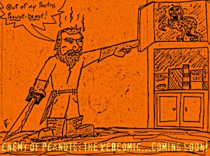
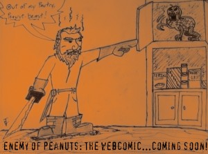
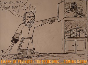
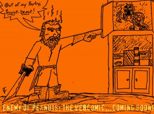
The first “promo” images (known to many as “doodles”) for Enemy of Peanuts: The Webcomic, which—as the images say—is coming soon!


Now, an explanation:
As a guy who reads a butt-ton of comics, it’s pretty hard not to come up with an idea or two for some of my own panel-by-panel storytelling—Enemy Of Peanuts: The Webcomic is one such idea. EoP came to me as the name for a strip I could do based on a few ideas that had been kicked around by some close friends and myself back in college (former roommate Matt Misch and good buddy Frank Johnson stand out as people I recall discussing the idea with, though there are assuredly many more). Essentially, the story would be based loosely on me but more so on my allergy (peanuts! legumes!), and the original idea was almost entirely me fighting Mr. Peanut…constantly. The idea has evolved quite a bit since then (including the creation of the Enemy of Peanuts, who—though fictional—is twittering away already), as it had a comic appeal I couldn’t quite pass up, and I’ve now started laying down some of the over-arching plot outlines, fight scenes and such. It should be a lot of fun, so stay tuned.
As far as the art goes, I’m well aware that I am not an artist (I’d say “amateur cartoonist” at best), but years of doodling comics and characters in notepad margins shouldn’t go to waste! So, here, I am going to be tackling art duties on the strip…for now. In a perfect world, some amazing unknown artistic talent (Holy Shit! It could be you!) will stumble across my “strips” (read: storyboards) and offer his skills to make this hobby into a real cinematic adventure. Or, with luck, practice will make perfect and I’ll get kinda good. Who knows?!
That said, I’d love to get some feedback on the photoshop aid I’m using for the time being. The promo images above are all the same save a photoshop effect making them look, hopefully, better. I’d be insanely appreciative of anyone who’ll leave some comments about which effects you like better and which image-style has or would have you most excited to read the EoP’s adventures every week (or whatever the posting schedule ends up being for the strip).
That’s all for now. Thanks for stopping by and checking the early stages of Enemy Of Peanuts: The Webcomic out, and please, leave a little feedback

I vote for the photocopy effect, I think it looks the coolest.
I say Crosshatch just so it looks like something you’d see in a newspaper.
Lol, you look like Yosemite Sam mixed with Jonah Hex xD
Also, what address can we send you stuff at, like muffin baskets and anti-peanut ray-guns.
Thanks, I think I’ll be going with Photocopy for now. Though, over at The Cool Kids Table, Kiel Phegley recently dropped a link to a rad site that breaks down numerous photoshop effects that can help you make good looking comics…so…I may try a few of those out before deciding on the final look.
Yosemite Sam and Jonah Hex, eh? Haha! The character is undoubtedly modeled a bit of myself, but I would say my biggest influence after that was probably Samurai Jack…still, a crazy western peanut slayer can easily be worked into the crazy plot threads I already have going.
Address, eh? I’ll have to see about that. Though you may want to send anti-peanut ray-guns, my many enemies might try to infiltrate my humble abode with peanuts! An EoP lives a life where caution is always a priority.
I always thought the best weapon against an evil peanut is a flamethrower because then you can eat the roasted offender afterwards. And if you can’t eat it, then at least it smells nice.
Or smells deadly…no, quick decapitation is best…plus, it doesn’t leave a mess of goop around to infect others, just littered half-shells.