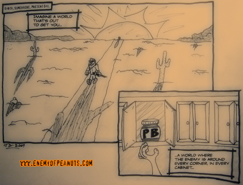
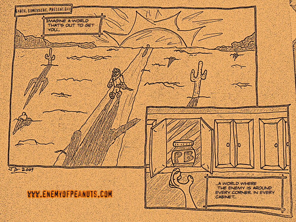
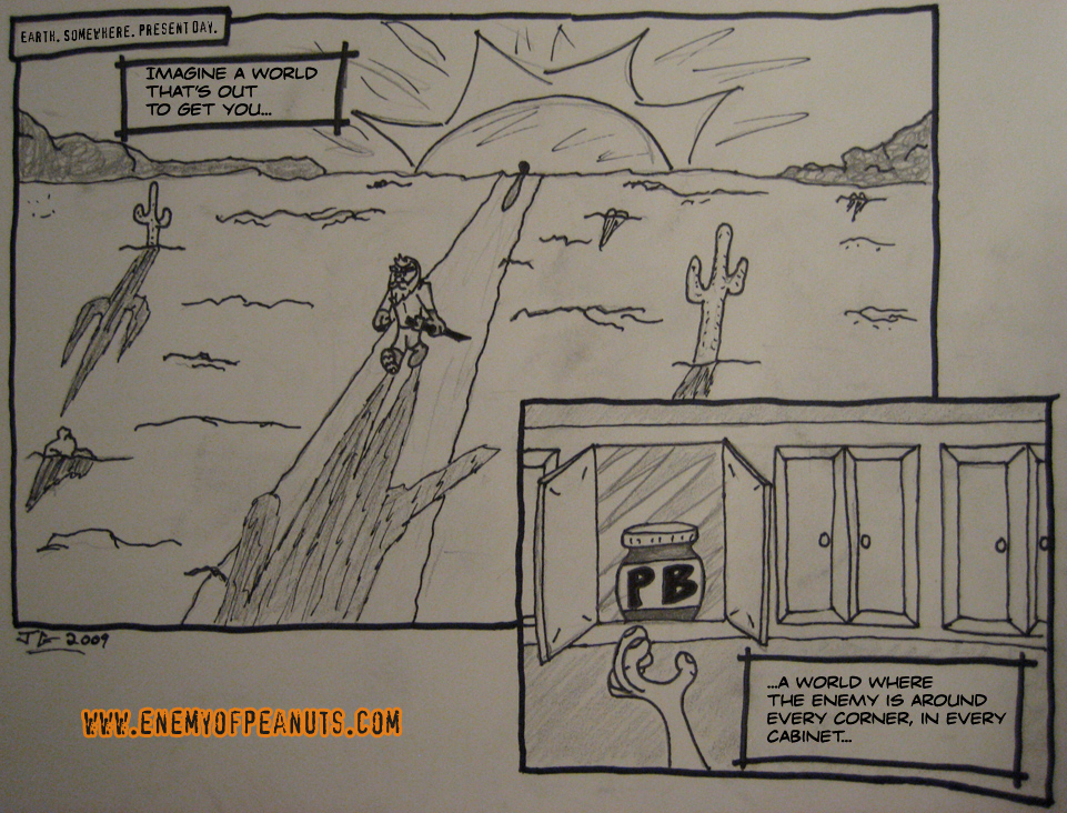
Last night I finally got a chance to sit down and finalize some of the storyboards I had been working on for Enemy of Peanuts: The Webcomic, so here’s the first two panels. I’m running a few different versions here because I still haven’t perfected much of anything (including my own artistic skills, so more versions put out means more chances to slightly impress someone, right?!). Right now, I’m shooting to deliver at least a few panels to a full sequence a week (anywhere from the meager two panels here on to five or seven bits of a fight scene), and I’ll try to post them each week on Sunday night or Monday.


Thanks for checking it out, folks! Any and all feedback is welcomed below!

For what it’s worth, I vote diffuse glow effect! It gives the comic an added layer, an almost tactile quality, seeming to be made from velum paper on top of drawing paper. And you know how I am a fan of the preservation of the artifactual in all mediums! Off to a great start!
i like the feel of the diffuse glow effect!
I’m down with the diffuse glow effect as well. Great work, my man!
Sepia the shit out of it!
Diffuse makes it look like a dream, I like the straight photo for regular scenes.
Also, lol, is that a jar of peanut butter following you down that trail!?
Jar of PB following me, eh? You’ll have to stay tuned to see the answer to that mystery.