I’ve learned that one of the nicest parts of my job is that I am frequently exposed to books that I might not have encountered were I not attempting to get them publicity. One of these recent surprises—I’m ashamed to say “recent,” as his work is really tremendous—was the cartooning of Graham Annable.
Over the last year, as I began doodling again due to the stress of my professional situation and the need for a creative outlet, I realized that the first job I ever wanted was that of a cartoonist. Somewhere along the line I convinced myself that art wasn’t my strong suit and I focused on writing. This eventually led to a pursuit of journalism which in turn led to reporting and editing comics news, but even with all that art in front of me, it never dawned on me to pick my pencil back up and start scribbling. A random cartoon I drew while at Wizard led to some encouragement and I started to draw regularly again.
As I attempted to take my hours of uninstructed middle school scrawling to a higher level, I began to take notice of cartoony strips I had more or less ignored for years. Suddenly, as I struggled with strip format, I could appreciate the enigmatic expressiveness of an art form where less was often more. Quite simply, and as cliched as it can possibly be said, I had not only fallen in love with cartooning again, but also the strip format that so permeated my childhood.
Musings aside, it was with a still relatively new-found love of cartooning that I was introduced to the art of Graham Annable.

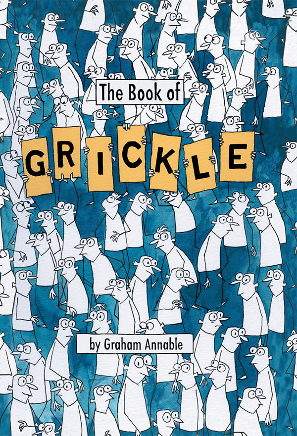
As I’ve spent a lot of time with this cover of late, so I’ll use it as my first example to point out how subtly expressive Graham’s simplistic looking Grickle can be. This cover is, at first glance, filled with a single character. And yet, with a closer look, each figure is unique. Sometimes with just a slight alteration, the gaze of one Grickle makes it express something entirely different than another. Seemingly simple, but try it. Expressing so much with such small distinction is insanely hard.
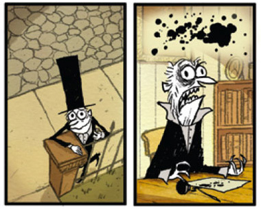
Add to that the eccentric yet profound punches that the interior comics pack, and “The Book of Grickle” is quite simply a volume that I can’t wait to get my hands on, even though I’ve been afforded the chance to read a majority of it already.
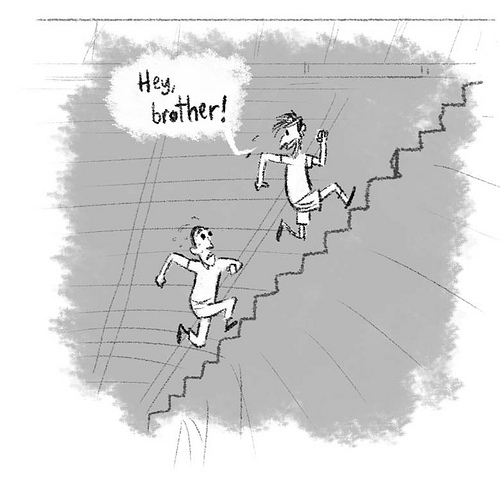
For example, take “Love Note,” a story done by Annable for MySpace Dark Horse Presents that first appeared on Comics Alliance.

This story has a sincere sweetness that sits alongside aspects that are completely deranged… and I love that! The fact it’s expressed in the art and not expounded endlessly upon in narration is also wonderful, but capturing the extremes of life in exaggerated cartoon forms is pretty damn perfect here and in every other bit of Annable’s work I’ve seen. Even more simply: It’s a style I enjoy and admire used to tell short tales that entirely entertain me.
And, of course, the fact that Annable has done some excellent “Lost” cartoons doesn’t hurt is case either!

———
Full disclosure, folks: It is my job to help get publicity for this book and sell it, but I dig it so much you can assured I’ll be picking up a copy myself!
Also: It’s been a while since I’ve mused/gushed about a comic. Alliteration is usually abundant when this the case, as it is here.
———
Added later on…
Comics Alliance has a “Book of Grickle” sample up. Check it out!

that does look pretty cool– I remember 3rd the chapter in all those cartooning/charicature books was facial expression. It is pretty cool how, you can do a lot with just a little. there’s a lot of information in an eyebrow ; )
Oh, absolutely! I can appreciate guys who go so crazy with detail it makes your eyes bleed, but sometimes just getting the point across in fewer lines is so much more intense.
I think a lot of stuff these days is over-drawn. Image comics started that whole super-buff, super-violent, darks are extremely dark, brights are extremely bright thing that I see in most comics now. Believe it or not, I think that one of the attractions people have to the simple/subtle style of golden/silver age comics is that there isn’t so much stuff in the picture that it allows the reader to project their own image onto the characters more and thus have a deeper connection with what is going on. Don’t know if that makes sense…
I don’t know that I completely agree, but I definitely think you have a point. Art that allows your imagination to work while taking it in is always going to be my preference, whether it’s more abstract or hyper-stylized.